
Ballentine Venn diagram
I studied Linear Regression in college, but oftentimes I have to admit I was memorizing equations such as: $\beta = (X’X)^{-1}X’Y$ or that the formula for the variance-covariance matrix was $\sigma^2(X’X)^{-1}$. Recently, while reading the book of P. Kennedy A Guide to Econometrics (Chap. 3), I discovered the concept of Ballentine Venn diagram. It allows an intuitive understanding of Linear Regression.
-
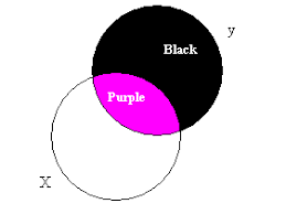
In the diagram above, the circle $y$ represents variation in the dependent variable $y$ and the circle $X$ represents variation in the independent variable $X$. The overlap, the purple area, represents variation that $y$ and $X$ have in common, in the sense that this variation in $y$ can be explained by $X$ via on OLS regression. The purple area could also represent the information employed by the estimating procedure in estimating the slope coefficient $\beta_x$. The larger this area, the more information is used to form the estimate and thus the smaller the variance.
-
The purple area represents the variation in $y$ explained by $X$. Thus, $R^2$ is given as the ratio of the purple area to the entire $y$ circle.
-
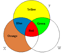
This figure is a Ballentine for two explanatory variables, $X$ and $W$. In general, the $X$ and $W$ circles will overlap, reflecting some collinearity between the two. In the multiple regression of $y$ on $X$ and $W$ together, the OLS estimator uses the information in the blue area to estimate $\beta_x$ and the information in the green area to estimate $\beta_w$, discarding the information in the red area. The information in the red area is not used because it reflects variation in $y$ that is determined by the variation in both $X$ and $W$, the relative contributions of which are not known a priori. The regression of $y$ on $X$ and $W$ together produce unbiased estimates of $\beta_x$ and $\beta_w$, whereas regression $y$ on $X$ and $W$ separately creates biased estimates of $\beta_x$ and $\beta_w$ because this method uses the red area.
-
If $X$ and $W$ are orthogonal to one another, the red area disappears. In that case, regressing $y$ on $X$ alone or on $W$ alone produces the same estimates as if $y$ were regressed on $X$ and $W$ together.
-
If $X$ and $W$ are highly collinear, the blue and green areas become very small, implying that when $y$ is regressed on $X$ and $W$ together very little information is used to estimate $\beta_x$ and $\beta_w$. This causes the variances of these estimates to be very large. Perfect collinerarity causes the $X$ and $W$ circles to overlap completely: the blue and green areas disappear and the estimation is impossible.
-
The variation in $y$ explained by $X$ and $W$ together is the (blue + red + green) area. There is no way of allocating portions of the total $R^2$ to $X$ and $W$ because the red area is explained by both, in a way that cannot be disentangled. Only when $X$ and $W$ are orthogonal, can the $R^2$ be allocated unequivocally.
-
The yellow area represents variation in $y$ attributable to the error term, and thus the magnitude of the yellow area represents the magnitude of $\sigma^2$, the variance of the error term.